
Character Collection
| Page | app/(dashboard)/characters/page.tsx |
| Route | /characters |
| Access | Dashboard navbar (🎭 button) |
What it does
A gallery of all characters the child has encountered across their stories. Each character is displayed as a portrait card with their name, image, and the story they appeared in. Kids can tap a character to see a detail modal and jump back to that story.
Screenshot: Character gallery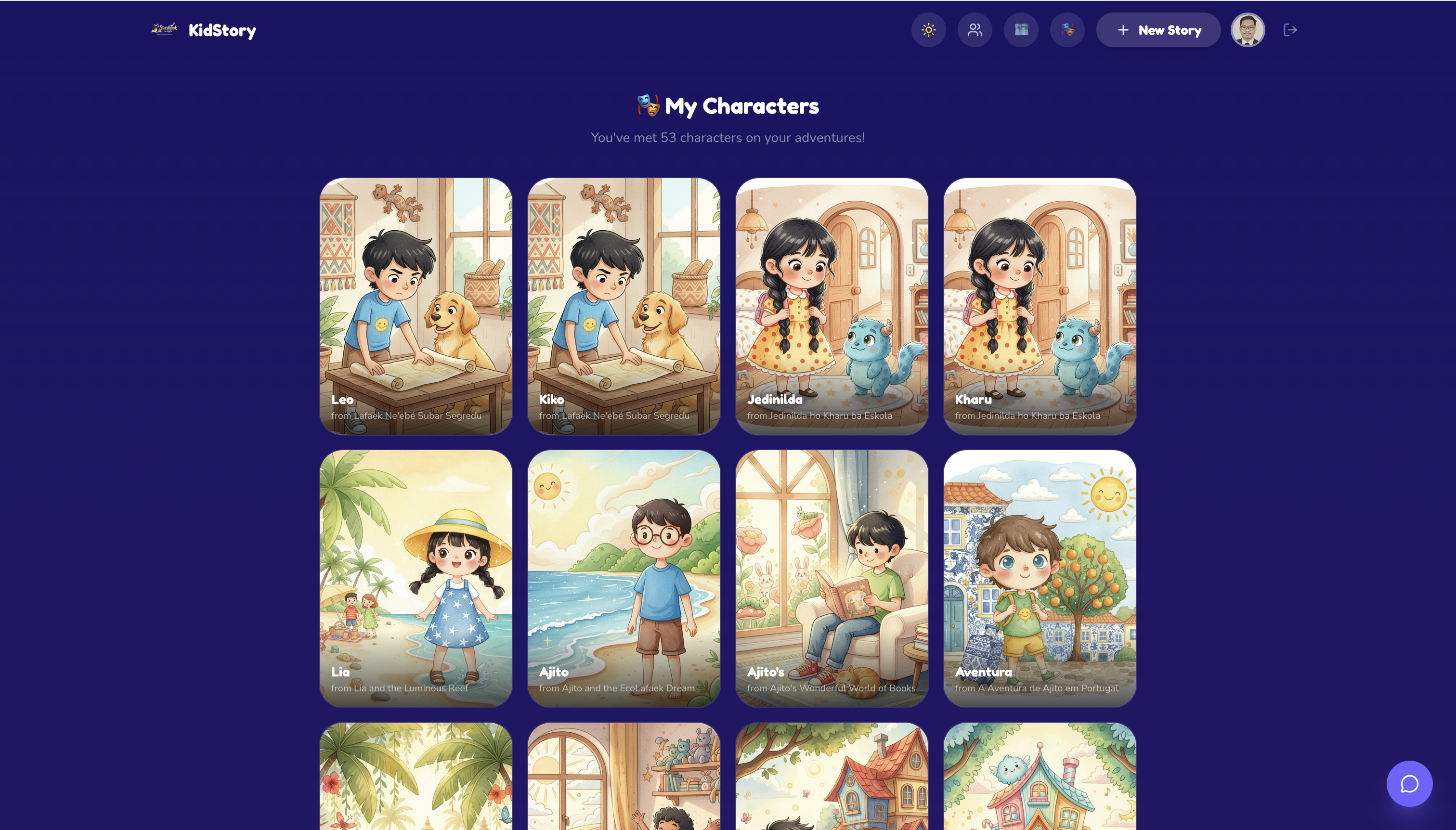
How character extraction works
Characters are extracted from story data using two methods:
Method 1 — Named character detection (primary)
The StoryWriter agent includes character names in imagePrompt fields using patterns like "named Luna" or "called Max". The extraction regex finds these:
imagePrompt: "A cheerful young character named Luna with curly brown hair..."
    │
    ▼
Regex: /(?:named|called)\s+([A-Z][a-z]+)/g
    │
    ▼
Extracted: "Luna" → paired with that page's imageUrl
Method 2 — Title-based fallback
If no named characters are found in a story's imagePrompts, the system:
- Looks for capitalized words in the story title (excluding common words like "The", "And")
- Uses the first page's image as the character portrait
- Falls back to "Main Character" if no name can be extracted
Deduplication
Characters are deduplicated by name (case-insensitive). If "Luna" appears in multiple stories, only the first occurrence is shown. This prevents the gallery from being cluttered with duplicates.
UI features
- Portrait cards — aspect ratio 3:4, showing the character's illustration with name overlay
- Gradient overlay — dark gradient at the bottom of each card for readable text
- Hover animation — cards lift and scale slightly on hover
- Detail modal — tapping a character opens a full-screen modal with:
- Large character image
- Character name
- Source story title
- "Read Story" button to navigate to the story reader
- Empty state — friendly message with a "Create a Story" button
- Loading skeleton — animated placeholder cards while stories load
- Dark/light theme — respects the user's dashboard theme preference
Data flow
Page loads
    │
    ▼
useUserStories(uid) → fetches all stories with pages[] from Firestore
    │
    ▼
extractCharacters(stories)
    │
    ├── For each story:
    │       For each page.imagePrompt:
    │           Match /(?:named|called)\s+([A-Z][a-z]+)/g
    │           If found → add CharacterEntry { name, imageUrl, storyTitle, storyId }
    │
    │       If no characters found for this story:
    │           Use title word + first page image as fallback
    │
    ▼
Render character grid (2 cols mobile, 3 cols tablet, 4 cols desktop)
Data structure
interface CharacterEntry {
  name: string; // Character name (e.g. "Luna")
  imageUrl: string; // Page illustration URL from GCS
  storyTitle: string; // Story the character appeared in
  storyId: string; // Firestore story ID (for navigation)
  pageNumber: number; // Which page the character image is from
}
Design decisions
- No additional API calls — characters are extracted client-side from existing story data. Zero cost.
- Image from story pages — uses the actual AI-generated illustration, so kids see their characters as they appeared in the story.
- Simple extraction — relies on the StoryWriter agent's consistent naming pattern in imagePrompts rather than an LLM call.
- Gallery feel — portrait aspect ratio and grid layout mimics a collectible card game, making it feel rewarding.
- Connected to stories — every character links back to their story, encouraging re-reading.